
University of Wisconsin-Madison Student Financial Account Redesign
Role
Tool
Duration
UX Researcher & Designer Intern @ The Center for UX, UW-Madison
Paper, Pen, Figma &Photoshop
4 Months
Project Vision
The UW-Madison student financial account page is a centralized data dashboard for account information. It also provides entry points for payment processing, which are handled by a third-party provider. Through this internship project, the redesigned product will provide an enhanced user experience by addressing user pain points, which help students spend less effort managing their financial account activities.
Challenges
With the current UW-Madison student financial account page, students are often confused by poor visual design, layout, and labels. Additionally, some sections of the product are missing essential information. These factors negatively impact students' user experience as there are no alternative tools to manage their financial account activities.
Research
To understand students' needs, goals, and pain points when using the Financial Account, I conducted interviews with 6 participants in my network (3 males and 3 females, representing native & international students, and undergraduate & graduate students), with a goal to answer 4 research questions. Responses from the participants were distilled into highly actionable insights for product iteration.
Are there design changes we can make to improve the user experience of the Financial Account?
Where do students get stuck? Why are they stuck?
What pain points or frustrations do students have?
Is the Financial Account interface informative enough?
Insights
Most Important Tasks
-
Check account balance & details
-
Pay for tuition
-
Check payment status & history
-
Download tax forms (1098-T)
Major User Frustration
1. The account balance did not offer detailed information, e.g., balance value.
2. Tab labels are not understandable (especially for non-native speaker students).
3. The affordance of the filter button in the past payment history is not strong enough. The current display only shows the current semester without indicating that the filter is set to the current semester by default.
4. The text layout should be improved.
Insights from the user interview help me understand users' perspectives and uncover many improvement opportunities. I then used an affinity diagram to separate and organize the usability issues into 5 categories: visual problem, lack of information, poor labels & organization, affordance, and findability. This diagram provided inspiration for subsequent design and ensured that the modifications are focused on addressing users' pain points.

Persona
I created two personas for both the undergraduate and graduate population of UW-Madison students to set a direction for subsequent redesigns and ensure that the modifications are faithful to what users need.


Brainstorm Ideas
With the affinity diagram for common themes in mind, I proposed detailed design changes to address user pain points under each of the 5 usability issues. I then created an affinity diagram to organize these ideas. The grouping of design ideas provided a clear direction on redesign strategy and helped me synthesize strategies into executable interface changes.

Sketch
Doodle Rough Ideas
Using simple, rough, yet illustrative sketches, I captured the first draft of design ideas. These "doodles" help to visualize and test different ideas, as well as consolidate the design strategies into solid foundations.

Paper Wireframes
With the redesign strategy in mind, I created paper wireframes with 2 design considerations: 1. Reorganize the tabs to reflect the different levels of task importance; 2. Use bounding boxes to group information within each tab.


Digital Wireframes
Based on feedbacks from my mentor, I updated the design and created digital wireframes.


Iteration
The wireframes were updated based on feedbacks and design critique I received from the design team at the Center for User Experience. Below are two example edits.
Date format
The date format can take many form based on different context and cultural backgrounds, even if it is communicated using English. For example, in many regions of the world, the day is displayed before the month, which is the opposite to that in the US. Therefore, using the month-day-year format without communicating the underlying format can be confusing and even cause overdue payment. To eliminate any format and cultural context induced confusion, the date is displayed with the month acronym spelled out.
Before
After


High-fidelity Mockups


Prototype

Account Balance & Make A Payment
In the redesigned Account Balance tab:
-
The account balance value is always shown, even if the balance is 0.
-
In addition, transaction details in the current month are displayed.
These changes help users stayed informed.
In the Make A Payment tab:
-
Large chunks of explanatory texts are moved to an information icon for a cleaner interface, e.g., "Badger Pay".
-
The label "Manage My Payment" is replaced with "Make A Payment" to make it more understandable and action-specific.
-
The ghost button is replaced with a contained button for better emphasis.
* "Make A Payment" is handled by the third-party service provider and out-of-scope. As a result, I did not redesign the process of making payment.

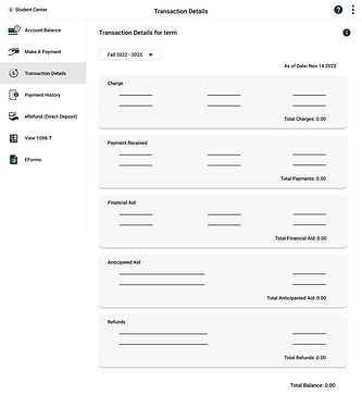
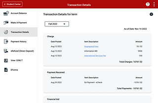
Transaction Details
This is the interaction where the user queries transaction details. Compared with the original version, the "Account Inquiry" is replaced with "Transaction Details" to make it more understandable.
Additionally, a semester filter is implemented and the transaction details for the selected term is displayed so that users don't need to leave the current page and figure out how to return.

Payment History
In the redesigned Payment History tab, I replace the filter icon with a set of specific “From x date” “To y date” styled filter to improve its affordance and inform users of the current time range.

eRefund (Direct Deposit) & View 1098-T
In the redesigned eRefund tab, I include Payment Method, the most relevant entry from the third-party provider (“Manage eRefund Enrollment”), and display an eRefund history to help users stay informed when managing eRefund.
* "Manage eRefund Enrollment" is handled by the third-party service provider and out-of-scope. As a result, I did not redesign this part.
In the View 1098-T tab, hyperlink for tax years and download icons are provided for tax form viewing and download.
Takeaways
Impact
The proposed modifications have the potential to improve the user experience of all UW-Madison students.
What I learned
In this project, I learned how to create redesign solutions with external constraints: focus on aspects that are flexible and make sure the modifications are aligned with the scope.