
Robinhood Mobile App Redesign
Role
Tool
Duration
UX Researcher
UX Designer
Paper & Pen
Figma
Zoom
Fall 2021 - Spring 2022
Project Vision
The Robinhood mobile App is an investing tool with an iconic, simplified UI. Being a user myself, I have found that at times, the app can present some usability challenges. With its popularity, I felt there were improvements that can increase the value to end users. So I decided to investigate it as part of a year-long course in UX research and design. The redesigned version provides a more informative UI and tools for stock analysis that help users make informed decisions and help the app stay competitive among similar products.
Challenges
In the current Robinhood app, the stock price line charts are presented in an unintuitive and uninformative way for all users. Additionally, it lacks stock analysis tools to help advanced investors (users) make informed trading decisions. However, the desired functionality with information comprehensiveness can impact the simplicity theme of the current app. A tradeoff is needed.
- Understanding the user -
Interview
One of the most important goals for stock trading platforms, including the Robinhood App, are to provide users with curated information for informed decision making. However, users with different levels of stock trading experiences can have a range of information needs.
To understand users' needs and goals, I started the user research session by conducting an interview with 5 participants in my network. Participants with diverse prior stock trading experiences (ranging from 1 months to more than 5 years) were included for a more representative sampling.
Key Findings
-
Existing charts are not informative.
-
Tools for stock analysis are desired.
-
Stock index tracking is not intuitive.
Going into the research, I had an assumption that users would want to socialize with peers and exchange stocking trading ideas. However, the results indicate that such social network feature is not desired or even deemed misleading to beginner investors by some participants.
Personas
To give a clear directions to solutions and make sure that the redesign stays focused on what users really need, I created two personas that give traits and requirements an identity and turns ideas on paper into real-life users.

User Journey Maps
Based on the personas, I created two corresponding User Journey Maps to visualize two processes that users go through to achieve their goals. These maps reveal moments of satisfaction and frustration throughout the user journey and uncover opportunities to address pain points for better user experience.

Competitive Analysis
With the key findings and areas for improvement distilled from the user interview in mind, I examined existing solutions with a goal to create a solid foundation for the redesign. Two popular stock trading mobile applications, as well as the Robinhood App, were evaluated based on selected features deemed vital from user interviews.
I found that only the Robinhood App offers significantly simplified user interface and streamlined operation that are friendly to beginner investors. In comparison, the competitors' interfaces are packed with buttons and tabs, which can be overwhelming especially in the small screen of a mobile phone. The competitors offer stock analysis tools, such as multi-stock comparison, and intuitive index tracking, which are currently missing in the Robinhood App.

- Defining the problems -
Problem Statement
From the perspective of the two personas, I wrote down two problem statements, which serve as the starting point for structuring the subsequent discovery work.
1. Rachel is a beginner investor who needs access to more comprehensive and intuitive information about the stock market because he wants to make informed decisions.
2. Ravesh is an advanced investor who needs a toolkit for stock analysis because he wants to make data-driven investments.
- Starting the design -
Brainstorm
I brainstormed a set of how-might-we (HMW) questions for each of the problem statements and finalized with two leading HMW, which defined the problem to be solved and defined the project’s scope and focus.
How Might We (HMW)

Affinity Diagram of Ideas

I proposed detailed design changes to address user pain points. I then created 2 affinity diagrams to organize the ideas under each of the 2 HMWs. These groupings of design ideas provided a clear direction on redesign strategy and helped me synthesize them into executable interface redesigns.


Sketch
Doodle Rough Ideas
Entering the design phase, I first visualized the design ideas with simple and rough sketches while keeping the design implications I collected so far. These "doodles" help to identify some helpful implementation details that were not captured in the brainstorm phase.

Crazy 8s
Using the "Crazy 8s" technique, I generated a wide set of concepts for each redesign idea in a short amount of time. In this step, I focused on the quantity rather than the quality of individual drawing with a tight time constraints, which prevented me from censoring ideas too early or pausing to think in too much detail. As a result, a pool of diverse design concepts were available to subsequent tasks.

Proposed User Flows
To understand key steps in the core experience of the redesigned Robinhood App, I designed two user flows. The first one involves using the dual chart tool to compare two stocks separately and taking notes, and the second one is for performing multi-stock comparison (in the same line chart). These user flows ensured that emphasis was placed on users' needs and experience while leaving out design details that would be solidified in later steps. It also helped me visualize and streamline the users' experience in more details.
For Dual Chart and Note Tools

For Multi-stock Chart Tools

Paper Wireframes
With the redesign concepts in mind, I created low-fidelity paper wireframes. Working through these preliminary sketches, I was able to not only quickly communicate most of the design concepts to peers but also receive valuable heuristic feedbacks.


Digital Wireframe


Build & Test Low-fidelity Prototype
To identify potential issues with the current design, I conducted a usability study with 5 participants. And here are some key findings.

Key Findings
-
The recent search results should be displayed on all search pages before users type anything, because users may want to check the same stock repeatedly.
-
User driven tests can easily go out of control, because sometimes users are too curious and click around to find what can be operated.
- Refining the Design -
Iteration
Working on the mockups, I updated the design incorporating both the usability testing findings and feedback from the second round of design critique from peers.
The recent search results are displayed before users type anything to facilitate users to retrieve recent searches.

To reinforce the recognition over recall, the icon for Toolbox was added next to the text. Additionally, the corresponding icon and name are shown when that tool is in use.


High-fidelity Mockup


Prototype

1. Track stock indexes
The individual stock page. Here users can track both dollar amount and percentage, zoom in/out, and drag the line chart

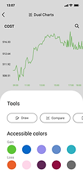
2. Analyze stocks with dual-chart
By using the dual-chart tool, users can compare two stocks on the same page

3. Change stocks in dual-chart
Swap stocks in dual-chart by clicking the search icon

4. Take notes
After analysis, users can document stock-specific thoughts and view prior notes using the note tool

5. Multi-stock comparison
With the Compare tool, multiple stocks can be added to the same line chart for comparison

6. Dark mode
A dark mode was implemented to help reduce eye strain and aid app use in dark environments
Accessibility
Color schemes used in the prototype have been tested via a Color Blindness Simulator to ensure the contents are accessible to people with different color perceptions.

Color theme for gain and loss can be adjusted in the App Appearance page

Additionally, the same function can be found in the toolbox for easy access
Takeaways
Impact
Based on a usability testing of the redesigned app, the proposed changes improve the experience of all Robinhood users, especially for beginner investors as one of them commented that "the new interface is much more intuitive to use now. I really like that all the price indexes are displayed instead of hidden away". Additionally, an advanced user mentioned that "I feel like the new version is more capable and might consider doing more stock analysis using Robinhood."
What I learned
-
Learned strategies and gained motivation to ensure the product is accessible to all users.
-
In usability studies, sometimes moderator driven tests are more efficient than user driven ones, because users can get too curious and "poke around" in the prototype with partial functionality.
Next steps
For accessibility testing, the current color schemes in the prototype were tested using a simulation tool. Additional usability studies should be carried out with actual users with different color perception.